
U-Case Design System
Created from scratch, this design system was used to create a component library in Angular - to be used in the creation of the U-Case SaaS website. The product was created to update the legacy offender management system. This components created for the design system are:Responsive with appropriate behaviour that works well on different screen sizesKeyboard-accessible for legacy system usersWCAG-AA compatible for visual accessibility


Logo
The logo of the parent company Unilink was modified to be monochromatic and modern - to be used across multiple digital products including U-Case.
Establishing Brand
The monochromatic logo was used primarily in the main navigation bar of the full-width and responsive website to be displayed at all times.
Also the brand colours, fonts and typography were carried across different products to reinforce the brand.

Colour Palette
The core colour palette was decided and approved through multiple passes and this was used majorly in all the components throughout the system. Complementary colours were added for the creation of graphs for dashboards.

Typography
Poppins was agreed as the font to used across the system and multiple styles agreed to be coded into the main CSS file. Sizes were in REM for proportional changes to responsive screen sizes.

Buttons
Primary buttons used to indicate preferred actions, for eg, Save.
Secondary buttons used to indicate other optional actions , for eg, Cancel.
Danger buttons used to indicate danger, for eg, Delete. Accompanied by a Main Secondary Button style, for eg, "Cancel".
Additional secondary buttons dropdown used within card headers where multiple actions required.


Multiple form fields created for use in forms and datatable filters. Styles added for text, textarea, radio buttons, single and multi-select dropdowns, date and time-pickers.
Form Fields


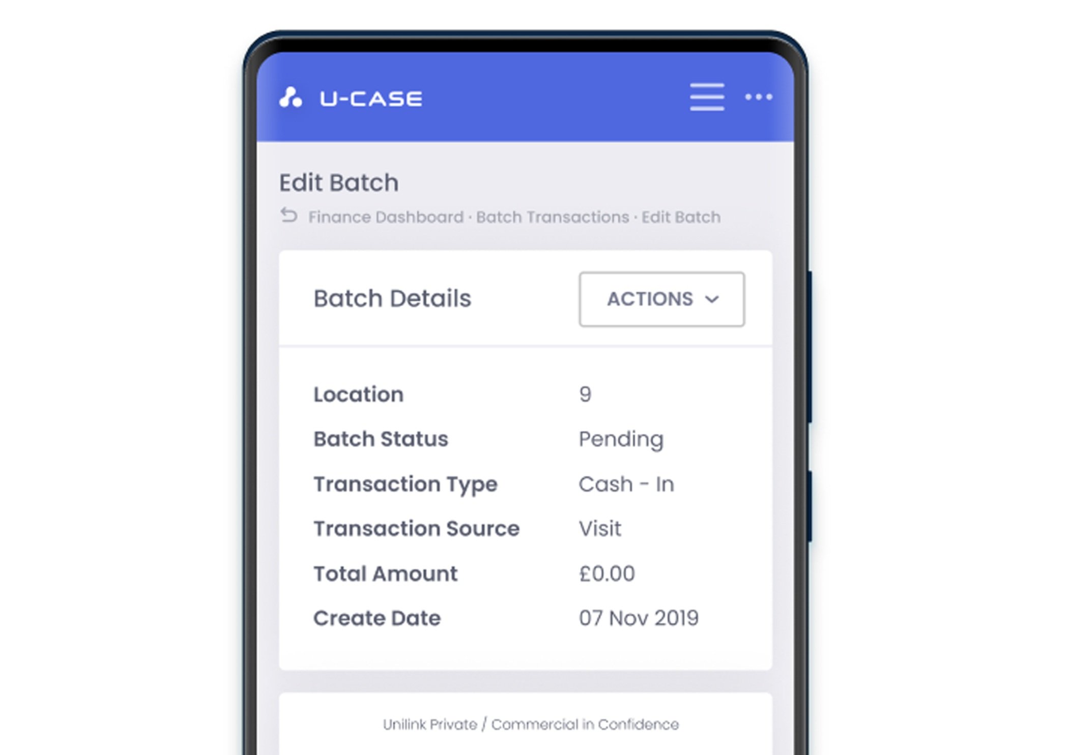
The design system was based on a responsive card-based layout for appropriate stacking of cards. Card padding and margins were pre-decided and coded into the component for ease-of-use while coding the front-end.
Cards


Datatables
Datatables display majority of the record information on the interface. The datatable component created had optional column filters which can be used to filter data within the columns, along with sorting. They also had the ability to expand to display secondary information optional buttons that would be used to add or modify information in the list.
Additional ability to add tabbed lists each with their own customisable button.
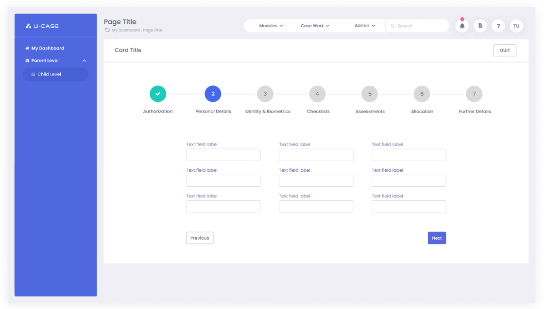
Wizard
The Wizard Component on U-Case provides a step-by-step process for complicated form-filling. Created to use where a single process requires multiple steps for completion. It features Next and Previous buttons to navigate within the process, along with clickable numbers that allow the user to navigate.
Also responsive, on smaller screen sizes the wizard behaviour allows the numbers and form fields to resize and stack appropriately.

Tree View
U-Case also features the Tree View component which allows the user to view hierarchical content in an organised manner. The user is able to open or close or view different levels in the hierarchy, add something within a certain level, view details or move the option up or down.

Snackbars were used to show users temporary information. Depending on use-case, they were configured to display an optional button and also a customisable display time to override the default time on the different snackbar classes.
Snackbars

Sections
The layout was divided into 3 main sections, top primary navigation, left secondary navigation and the main content.
Due to it being an expansive system with many options, each item on the primary navigation opens a secondary left navigation menu.

Similarly for responsives, the main sections were stacked appropriately at different media sizes so all relevant options would still be accessible.
Responsive Layout

Error Pages
Along with many other multiple components, custom error pages were also designed for different kinds of errors detailing the follow-up action the user should take.